The majority of newsletters are read on a computer screen, where resolution and the size of a pixel determine the clarity and sharpness of images. That means that when making graphics for newsletters, consider how they will look in pixels, not inches. For example, you wouldn’t want to design an image to be 3 inches wide by 4 inches high to be viewed on a screen. You wouldn’t be able to see it clearly, and it would probably look like a little postage stamp.
Here are ten tips for creating newsletter graphics that will look good when viewed on a computer:
1. Make it Big and Clear Enough
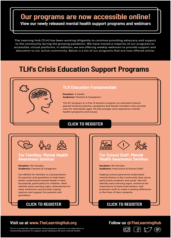
Make your newsletter template infographics big enough to see clearly, but not so large that they slow down download time. The faster the newsletter downloads, the more quickly it can be read. Generally, you should limit graphics to less than 100 KB in size each. But when choosing photos, go for high-resolution photos and artwork (at least 150 dpi) when possible to ensure the clearest image.
Source: Venngage
2. Choosing The Right Colors
Use a limited color palette for your newsletter design to preserve clarity and sharpness and limit file size. For example, instead of using 24-bit color (or more), use 8- or 16-bit color (if you can’t limit colors, reduce the number of colors used). Also, if your camera takes photos in JPEG format, limit the number of colors to 256. If you have a photo with many colors, reduce it to grayscale and add more contrast between pixels.
At the same time, use bright, contrasting colors for text and backgrounds to increase contrast and make it more legible. After creating your graphic, think about colors that will look good together on both a computer monitor screen and if photocopied.
If you need newsletter templates of all colors, check out Venngage.
3. Make Use Of Borders
If you want a border around an image to highlight it, don’t use a shadow effect – instead, increase the size of the box so there is more white space between the image and border.
4. Clip Photos
Use a clipping path if you have a photo with a complicated background that does not contribute to your message. Clipping paths remove a section of a photo so you can easily place it in another area.
5. Keep Font Size At 14
When making text files, especially with an email newsletter, use at least 14-point type size to ensure readability. Keep type simple and sans serif for the best digital resolution that is not distracting from your message.
6. Reduce Image Contrast
If you have two graphics so close together that they appear as one image onscreen, reduce the contrast so they are distinguishable. Generally, one or two objects in a graphic are enough, but never more than three—any more and the eye has a hard time finding what’s important.
Source: geralt/Pixabay
7. Keep It Simple
If you can’t readily identify what a graphic is about, or if it looks too complex to understand quickly, simplify it by removing superfluous information. Remember that a newsletter’s goal is communication—so for effective communication, don’t include anything unnecessary in your graphics.
8. Always Check the Spelling
Don’t forget to spell check! Trust me—it’s embarrassing when typos appear in a graphic promoting your business or organization.
9. Seek Professional Help
If you need more information on how to make good graphics for newsletter templates, seek the help of a graphic designer. This person should be able to help you with your newsletter examples and design as well as what types of graphics will best enhance your message.
10. Keep It Legal
Make sure you have permission to use any images, photos, logos or icons that are not your own.
11. Save The Newsletter In All Formats
Save your graphic file in the GIF, JPEG, or PNG format for maximum compatibility across e-mail clients and platforms.
Like what’s been said that the GIF format only supports 256 colors while JPEG and PNG support millions. Remember to test your graphic, or GIF file, with different e-mail clients (Internet Explorer, Outlook Express, AOL, Yahoo! Mail) to make sure it will display properly for users of each application.
12. Preview Your Work
Use the preview option in your e-mail client to see what type of quality you can expect when sending your graphic. If good resolution cannot be achieved, reduce the size of your graphic so it will download quickly. Also, create a version of your graphic in black and white if you think users might have difficulty viewing color graphics in their e-mail client or on a user’s computer screen.
13. The Right Name Matters
And finally, be sure to include a descriptive file name and alt text (alternative text) when saving your graphic for e-mail newsletters, which will increase accessibility and compatibility across different email clients and platforms.
In Closing
Graphics for newsletters can be one of the most important aspects of getting your newsletter read. So follow these thirteen things to consider when creating graphics because they will make your newsletters more attractive and readable.

